Logo Maker / Logo Colors
Imagine you're walking down a bustling city street, a kaleidoscope of signs and logos competing for your attention. Amid the clamor, one logo catches your eye—a simple, elegant design bathed in a soothing shade of blue. Instantly, you feel a sense of calm and trust. You're not sure why, but you're drawn towards it. That's the power of color in logo design.
Colors speak louder than words. They can whisper soothing sentiments, shout vibrant declarations of boldness, or articulate an unspoken promise of quality. In logo design, the choice of color can be the difference between fading into the city's visual noise or standing out and leaving a lasting impression.
But how do we understand what colors are saying? How do we know which colors will invite trust, incite action, or evoke luxury? That's where color psychology comes in. It's the study of how colors affect our perceptions and behaviors—an essential piece of the branding puzzle.
In this guide, we will take a deep dive into the world of logo colors, unraveling their meanings, their psychological effects, and how you can harness their power to create a logo that speaks volumes about your brand. So, let's embark on this vibrant journey into the world of colors.

Table of content
Unveiling Color Secrets
What Secrets Does Color Psychology Hold?
Explore how color psychology shapes our emotions and decisions, impacting brand perception and logo design. Get ready to decode color mysteries.
Color psychology, a mesmerizing field of study, explores the profound influence that colors have on human emotion, cognition, and behavior. At its core, it aims to understand how the hues around us impact our everyday decisions, from the clothes we wear to the brands we choose to engage with. This science is particularly significant when it comes to branding and logo design, as it forms the underpinnings of how a brand is perceived and received by its audience.
But how exactly does color psychology work its magic? Let's take the classic example of red. When you see red, it might ignite feelings of passion, urgency, or even warning. It's no accident that sale signs are often red to create a sense of urgency, or that stop signs use the same color to demand attention and alertness. This is color psychology in action.
Similarly, other colors can evoke an array of emotions and reactions. Blue, for instance, often imparts feelings of calmness and trust, making it a popular choice for corporate and tech companies who wish to convey reliability and professionalism. On the other hand, green often signals growth and renewal, making it a perfect fit for environmental or finance-focused brands.
The captivating part of color psychology is its capacity to influence consumer behavior subtly yet significantly. By carefully selecting colors that align with their brand personality and desired perception, businesses can establish stronger connections with their audience, influence their feelings towards the brand, and ultimately, drive desired consumer actions.
As we delve further into this guide, we'll unearth the meanings behind individual colors and discover how you can use color psychology to sculpt a powerful, resonating brand logo.
Ready to unlock the secrets of color psychology? Let's dive in!
The Color Spectrum
What Do Different Colors in Logos Really Mean?
Dive into the world of colors and discover their hidden meanings in logo design. From the fiery red to the serene blue, every hue narrates a unique story.
The Passion of Red in Logos
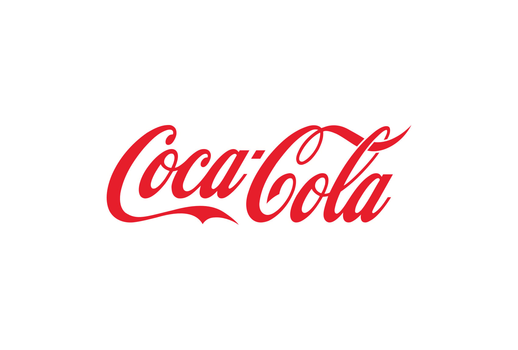
Red, the color of love, passion, and dynamism, often takes center stage in logo designs where energy, excitement, or a call to action is necessary. It's a bold choice, signifying strength and audacity. Brands like Coca-Cola and Netflix sport red in their logos, captivating audiences with their vibrant persona.
The Calmness of Blue in Logos
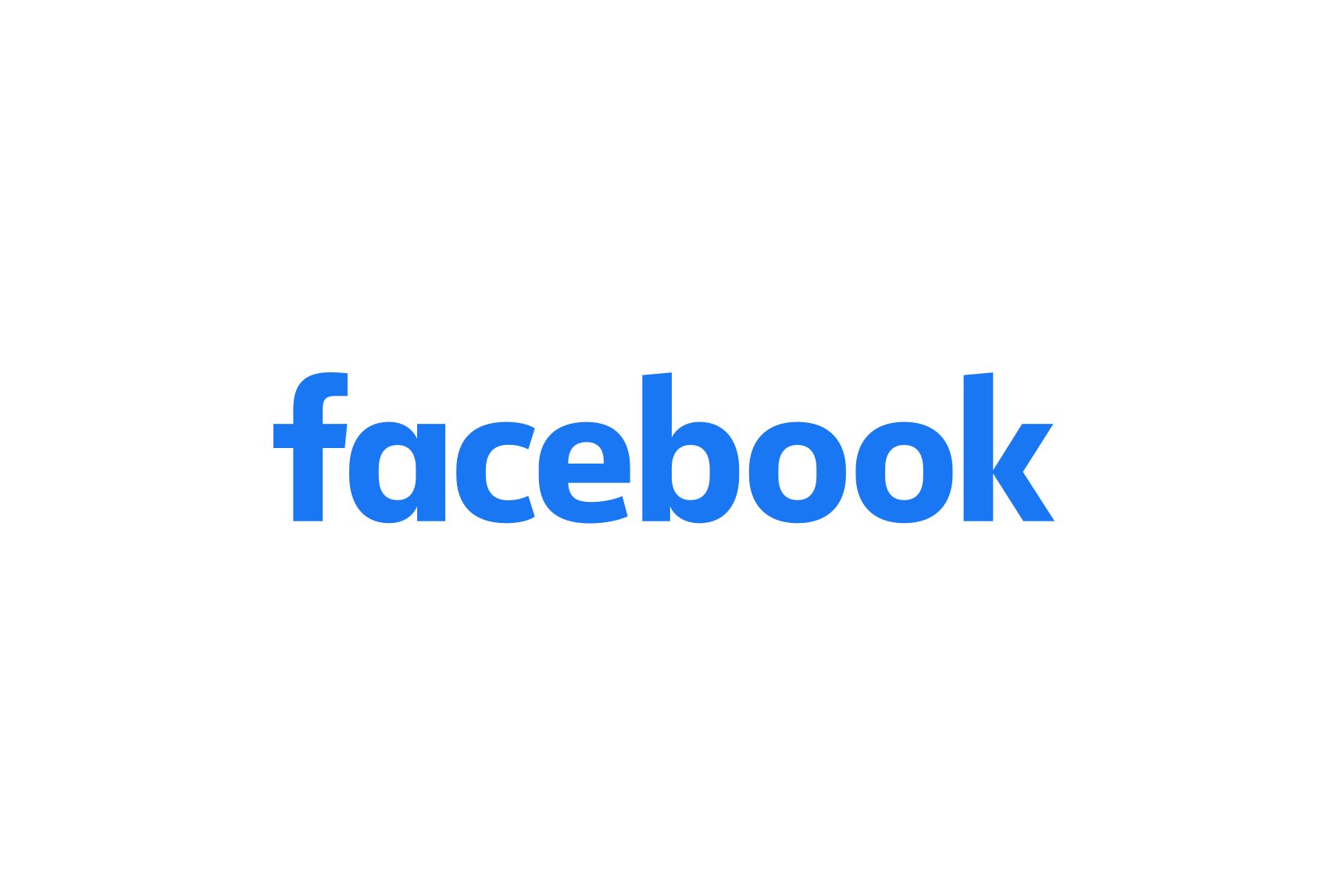
Blue, often associated with peace, stability, and reliability, is a frequent choice for corporations and tech companies. It conveys trust, making it a solid bet for brands that aim to foster a sense of security. Giants like Facebook and IBM are shining examples of using blue to denote reliability and professionalism.
The Growth of Green in Logos
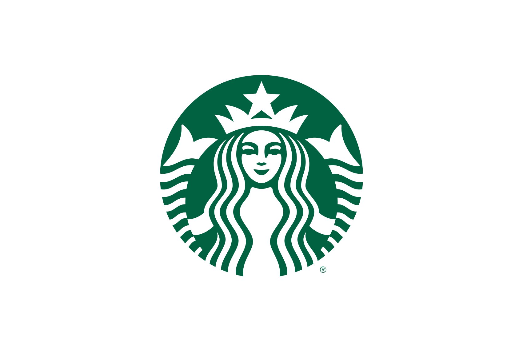
Green's strong ties with nature give it connotations of growth, renewal, and harmony. It's a popular choice for environmental organizations, but it's also commonly used by financial institutions symbolizing growth and prosperity. Look to brands like Starbucks and John Deere that utilize green to its fullest potential.
The Optimism of Yellow in Logos
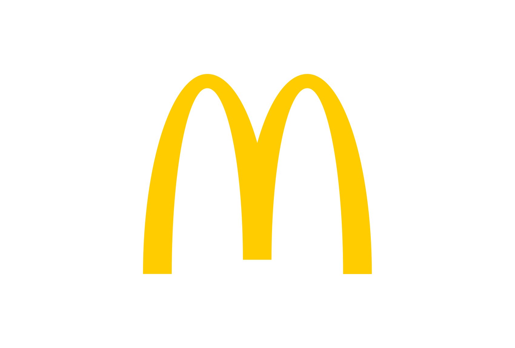
Yellow, the brightest color perceived by the human eye, is associated with optimism, creativity, and happiness. It can be an attention-grabber if used correctly. Brands like McDonald's and Nikon use yellow in their logos to exude cheerfulness and positivity.
The Royalty of Purple in Logos
Purple, a blend of the stability of blue and the energy of red, often symbolizes luxury, ambition, and power. It's a favorite among brands that aim to convey opulence or creativity. Consider logos from brands like Cadbury or Twitch that make fantastic use of this royal hue.

The Contrast of Black and White in Logos
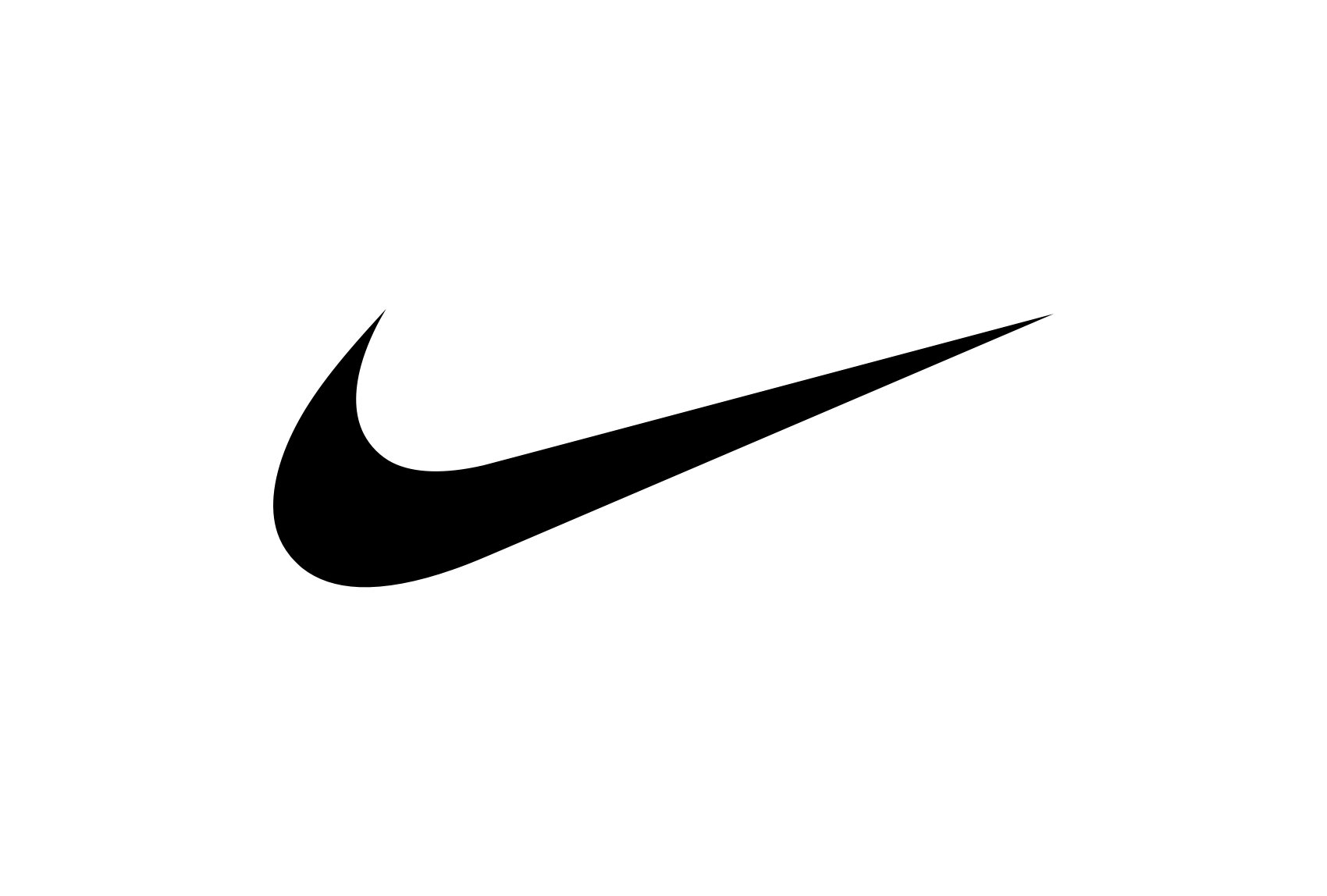
Black and white, the colors of ultimate contrast, often symbolize balance. Black denotes power and elegance, while white signifies purity and simplicity. Many brands like Nike and Apple use this contrast to create timeless and versatile logos.
Know more about black logo and white logo design!
The Prestige of Gold in Logos
Gold, associated with wealth, luxury, and success, adds a touch of elegance and prestige to logos. It represents the highest standards and quality, making it a popular choice for high-end brands in industries such as fashion, jewelry, and finance. Logos incorporating gold, such as those of Rolex and Louis Vuitton, exude a sense of opulence and exclusivity.
The Playfulness of Pink in Logos
Pink, often associated with femininity, tenderness, and playfulness, can bring a sense of joy and warmth to logos. It is commonly used by brands targeting a predominantly female audience or those aiming to convey a sense of youthful energy. Examples of logos incorporating pink include Barbie and Victoria's Secret, showcasing its ability to evoke a fun and lighthearted atmosphere.
The Vibrancy of Orange in Logos
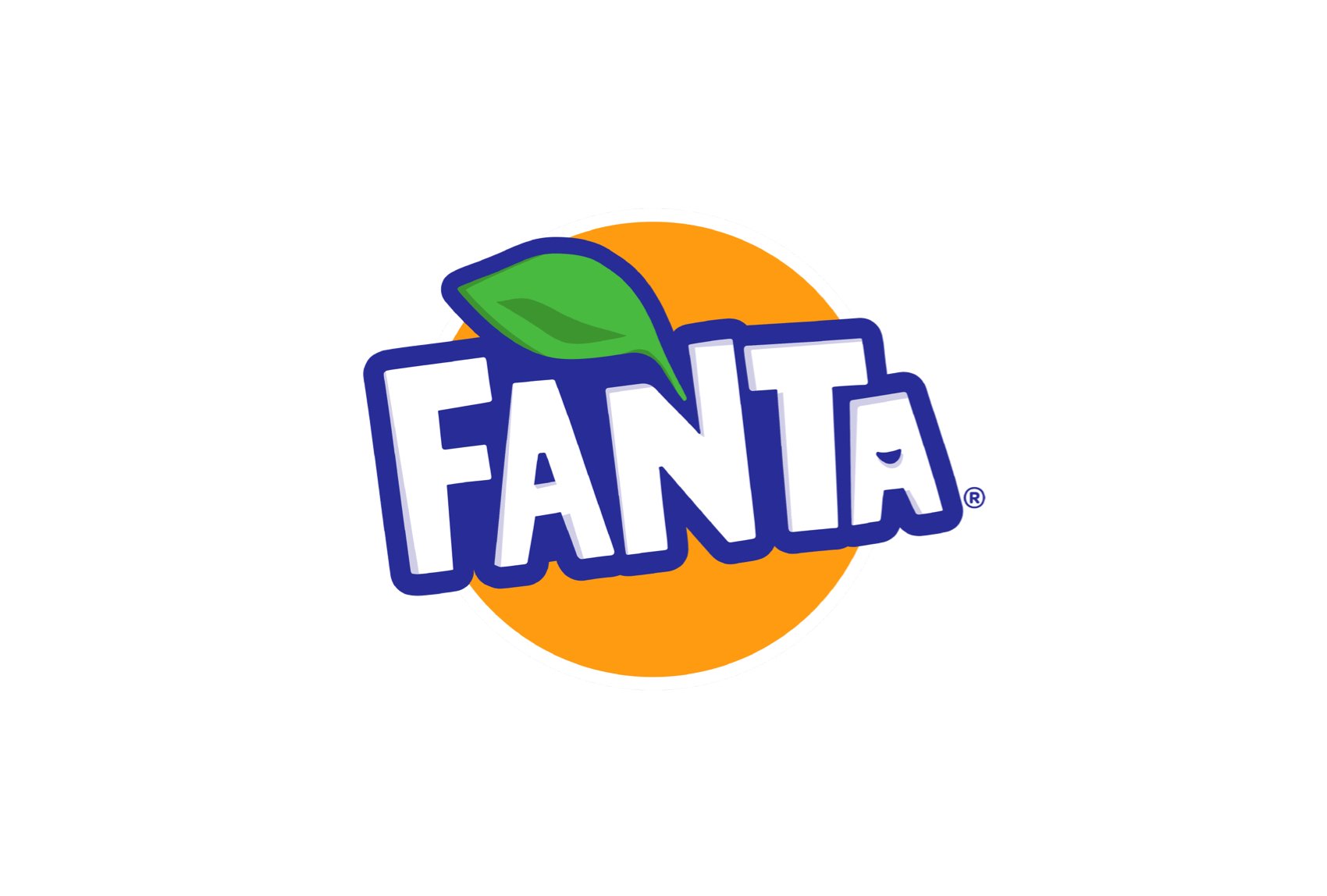
Orange, a color that combines the energy of red and the cheerfulness of yellow, is frequently used to create logos that exude enthusiasm, warmth, and excitement. It grabs attention and stimulates the senses, making it a great choice for brands in the entertainment, sports, and food industries. Companies like Fanta and Nickelodeon utilize orange in their logos to project a vibrant and energetic image.
The Sophistication of Grey in Logos
Grey, often associated with neutrality, balance, and sophistication, is a versatile color choice for logos. It can convey a sense of professionalism, modernity, and reliability. Grey is frequently used in logos of technology companies, financial institutions, and high-end brands that strive for a sleek and timeless aesthetic. Examples include logos from Apple's MacBook line or Mercedes-Benz, showcasing the understated elegance of grey in logo design.

The Spectrum of Other Colors in Logos
While red, blue, green, yellow, purple, black, and white are some of the most common colors in logo design, other colors like pink, orange, and brown also have their unique meanings and can be used effectively depending on the brand's personality and target audience. Pink, for instance, often symbolizes femininity or romance, while orange represents creativity and adventure, and brown signifies earthiness and reliability. The key is to choose a color that aligns with your brand's values and resonates with your audience.
Explore logos in other colors:
silver logo | brown logo
Disclaimer: Logomaster.ai is not affiliated with any of the companies whose logos are featured in this session. The logos are used for educational and inspirational purposes only. All trademarks and registered trademarks are the property of their respective owners.
How Do Colors Shape Your Brand Perception?
Imagine walking into a store and being instantly drawn to a particular product. Not because of the product itself, but because of its vibrant, eye-catching packaging. That's the power of color.
The Tale of Colors and Brand Identity
Let's take the journey of a young startup. They have a groundbreaking product and a dynamic team ready to shake up the market. But they are missing one thing - a strong visual identity. So, they decide to craft a logo. They choose a bold red color, symbolizing their energetic, passionate drive. This red doesn't just beautify their logo; it becomes the lifeblood of their brand identity, pulsating through their every branding endeavor.
The Color Chronicles and Brand Perception
Fast forward a few years, and our startup is now a well-established brand. Their customers see the red logo and instantly associate it with the brand's vitality and passion. The color has managed to communicate the brand's personality, forging an emotional connection with the audience, influencing their perception. The green of a health-conscious brand, the sophistication of black and white - every color has a story to tell.
Colors and The Saga of Brand Recognition
Studies indicate that color can elevate brand recognition by up to 80%. Our once startup, now a household name, is instantly identifiable, thanks to the striking red in its logo. Think about it. When you see a can of Coca-Cola or the golden arches of McDonald's, you instantly recognize them, even without the brand name. That's the story of colors and brand recognition.
Colors in your logo and brand are more than an aesthetic choice. They're strategic narrators, spinning the tale of your brand's identity, shaping perceptions, and boosting recognition. So, when it comes to picking colors for your brand, remember: you're not just choosing a hue; you're choosing a story.
Master the Color Game
How to Choose the Perfect Colors for Your Logo?
Dive into the art and science of selecting the right colors for your logo. Understand your brand personality, know your audience, consider cultural nuances, and glance at your industry norms to make a perfect color choice for your logo.
What's Your Brand Personality?
Picture your brand as a person at a social gathering. Is it the vibrant life of the party, or the calm, collected intellectual? Identifying your brand personality helps you pick colors that mirror this character. A fun, energetic brand may opt for bright, bold colors, while a brand that exudes sophistication might lean towards cooler, subdued tones.
Who's Your Audience?
Your audience is the hero of your brand story, and your logo should resonate with them. A younger demographic might be drawn to modern, bold colors, while an older audience might appreciate more traditional, muted hues. Understanding your audience's tastes can guide your color selection process.

Where in the World?
Colors are viewed through a cultural lens. A color that is perceived positively in one culture may have a completely different connotation in another. For instance, white is associated with purity and innocence in Western cultures, but symbolizes mourning in many Eastern societies. Being mindful of your audience's geographical and cultural background is crucial in picking the appropriate logo colors.

The Color Palette of Your Industry
Certain industries have traditional color schemes. Financial institutions lean towards blues to evoke trust and stability, while organic food companies opt for green to represent health and nature. While it's important to stand out, considering industry norms can help you strike the right balance between differentiation and relevance.

Choosing the right colors for your logo is part science, part art, and part understanding your brand, audience, and context. It's about striking a balance between staying true to your brand personality, resonating with your audience, and being mindful of cultural nuances. Remember, your logo is more than just a pretty face for your brand; it's a powerful communication tool. Use it wisely!
More Logo Inspiration