Free Health Logo Design & Top Ideas from Healthcare Industry
Logo Maker / Logo Ideas / Health Logo Design
A powerful logo is essential for establishing a strong brand identity in the health industry. It acts as the face of your brand, representing your company's values and uniqueness. A well-designed logo creates a memorable and recognizable image, fostering trust and credibility among your audience. It effectively communicates your brand's personality and expertise while ensuring consistency across various platforms. With the assistance of our Free Health Logo Maker and inspiration drawn from renowned healthcare companies, you can design a remarkable logo that truly embodies your brand essence. Make a bold statement in the health industry with an exceptional logo that reflects innovation, trust, and excellence.
Table of content
Explore Health Logo Examples for Creative Inspiration
Immerse yourself in a thoughtfully curated collection of notable health logos from prominent companies that have made a lasting impression. These inspiring logos have effectively captured the essence of their respective companies and can serve as a rich source of inspiration for creating a remarkable logo for your health venture.
Johnson & Johnson
The Johnson & Johnson logo features an iconic logotype in a custom cursive font, with a distinctive ampersand connecting the two parts of the company's name. The elegant and timeless design reflects the brand's longstanding history and conveys a sense of trustworthiness and reliability through its unique lettering and intense shade of red.
Pfizer
The Pfizer logo has undergone several transformations throughout its history, with the current design featuring a bold and confident blue emblem formed by ribbon-like lines. The lettering has evolved over time, but the overall concept remains recognizable, reflecting the company's commitment to progress and its prominent position as a leading pharmaceutical company.
Merck & Co.
The Merck & Co logo reflects symmetry and harmony, embodying the responsible approach of the pharmaceutical company in its research and production of drugs. The logo combines large, bold letters with geometric shapes, representing biochemical and pharmacological themes, while the color palette of emerald green and white adds a sense of freshness and professionalism to the brand's visual identity.
Novartis
The Novartis logo features a stylized emblem resembling a harp or mortar and pestle, symbolizing innovation and the company's focus on healthcare. The combination of vibrant colors and the Trajan Bold typeface in the wordmark conveys a sense of professionalism and trust in the pharmaceutical industry.
GlaxoSmithKline (GSK)
The latest GSK logo, introduced in 2022, features a stylized uppercase lettering in a gradient orange color palette. The twisted connections between the bars of the letters add a sense of dynamism and innovation, reflecting the company's commitment to providing high-quality medications and healthcare solutions.
AstraZeneca
The AstraZeneca logo showcases the intertwining of the letters "A" and "Z," representing the merger between Astra AB and Zeneca Group. This design symbolizes the collaboration and integration of the two entities, emphasizing their combined strength and commitment to the pharmaceutical industry.
Roche
The Roche logo, featuring a hexagon enclosing the wordmark, signifies harmony, balance, and the universe. The clean and simple design, along with the calming blue color, conveys trust, professionalism, and a sense of safety, reflecting the pharmaceutical company's commitment to excellence in healthcare.
Sanofi
The current Sanofi logo, introduced in 2022, features a bold lowercase wordmark with softened lines and futuristic contours. The incorporation of purple circles adds a touch of modernity and creativity, while the black color conveys strength and professionalism, reflecting Sanofi's commitment to innovation in the pharmaceutical industry.
Abbott Laboratories
The Abbott logo features a stylized one-line lowercase letter "A" with an open contour, representing stability and progressiveness. The addition of a light blue color in 2006 adds a sense of hope and energy, while the bold and elegant serif wordmark complements the modern emblem, reflecting Abbott's commitment to innovation and client well-being in the pharmaceutical industry.
Eli Lilly and Company
The Lilly logo features a stylized version of Colonel Eli Lilly's signature, reflecting the company's connection to its founder and its dedication to its consumers. The bold red font on a white background exudes a sense of history and reliability, while the single shade of red represents care and the company's mission to improve people's health and well-being.
Disclaimer: Logomaster.ai is not affiliated with any of the companies whose logos are featured in this session. The logos are used for educational and inspirational purposes only. All trademarks and registered trademarks are the property of their respective owners.
Create your own logo now
Tips and Best Practices for Health Logo Design
Learn key tips and best practices for creating logos that effectively represent your brand and resonate with your target audience.
Color
Color is a crucial element in health logo design, as it influences how individuals perceive and remember your brand. It possesses the power to evoke emotions and associations while creating a visually impactful and memorable design. Carefully selecting the right color palette for your health logo can establish a visual identity that resonates with your target audience and communicates the desired message.

Typography
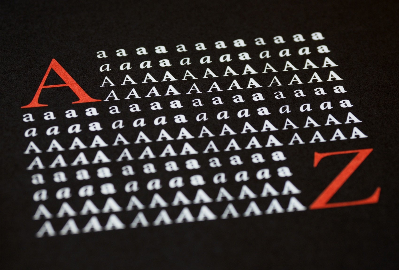
Typography holds great significance in health logo design. The choice of fonts can effectively convey the style, tone, and uniqueness of your brand, making a lasting impression. When considering fonts for your health logo, it is important to prioritize factors such as legibility, readability, and the overall style and personality of your brand. Paying attention to font pairing and hierarchy ensures a harmonious and impactful design that aligns with the values of the health industry.
Graphic Elements
Incorporating relevant graphic elements into health logo design is equally important. Custom graphics, icons, and visual elements contribute to conveying the personality and values of your brand. When incorporating these elements into your health logo, ensure they align with your chosen color palette and typography, resulting in a cohesive and memorable design that reflects the essence of your healthcare offerings.
Create a Health Logo in 5 Easy Steps
Create and edit logos with ease, no design skills required.
5 easy steps to create a logo
1. Select your industry and style preferences
2. Enter your company name
3. Review AI-generated proposals
4. Select and customize your chosen logo
5. Download your logo in high-quality files
Logo Maker and Logo Design
Other Logo Examples
Create your own logo now
Create and edit logos with ease, no design skills required.