Free Tech Logo Maker & Top Ideas from Famous Tech Companies
Logo Maker / Logo Ideas / Technology Logo Design
A strong logo is crucial for a tech company's brand identity. It serves as the face of your brand, representing your company's values and uniqueness. A well-designed logo creates a memorable and recognizable image, fostering trust and credibility. It communicates your brand's personality and expertise, while ensuring consistency across platforms. With our Free Tech Logo Maker and inspiration from famous tech companies, you can design a standout logo that captures your brand essence. Make a bold statement in the tech industry with an exceptional logo that reflects innovation and excellence.
Table of content
Examples of Tech Logos for Inspiration
Discover a curated selection of renowned tech logos from industry giants that have made a lasting impact. These iconic logos have successfully captured the essence of their respective companies and serve as inspiration for creating a remarkable logo for your tech venture.
Apple
The Apple logo, designed by Rob Janoff in 1977, is an iconic symbol of innovation and style. The bitten apple represents knowledge, referencing both Isaac Newton's discovery and the biblical concept of Adam and Eve's pursuit of knowledge, while the bite itself cleverly plays on the word "byte," emphasizing the brand's association with technology and digital data. With its minimalistic design and timeless appeal, the Apple logo has become one of the most recognizable and influential visual identities in history.
The Google logo, redesigned in 2015, features a bold and minimalist look with a custom sans-serif typeface called Product Sans. The vibrant and diverse color palette reflects Google's global reach and cultural inclusivity, while the use of bright hues adds an optimistic and energetic feel to the logo, contributing to Google's iconic brand identity and remarkable success.
Microsoft
The current Microsoft logo, introduced in 2012, showcases a clean and modern design with a geometric icon composed of four small colorful squares forming a larger square, representing unity and diversity. The light gray logotype, written in Segoe Semibold sans-serif typeface, exudes a sense of professionalism and simplicity, reflecting Microsoft's role as a global leader in information technology.
Amazon
The current Amazon logo, introduced in 2000, features a clean and minimalist design with a lowercase wordmark "Amazon" accompanied by a bold yellow arrow that starts from the letter "A" and ends at the letter "Z," symbolizing the company's extensive product range and customer satisfaction from "A to Z." The smile created by the arrow portrays a positive and customer-centric approach, reflecting Amazon's commitment to delivering a seamless shopping experience.
The Facebook logo has undergone minor modifications since its launch in 2004, but has retained its blue and white color palette. The blue background may have been chosen due to Mark Zuckerberg's color blindness, as he can distinguish between shades of blue better than other colors. The combination of blue and white conveys a sense of purity and youthfulness, aligning with Facebook's identity as a global social networking service. The logo's simple yet recognizable design has become synonymous with the brand and is instantly recognizable worldwide.
Intel
The latest Intel logo, introduced in 2020, features a simplified design with squared angles in the letters "i" and "l," conveying stability and reliability. The subtle modifications, such as the broader and more classic shape of the "n" and "e," reflect the company's emphasis on its heritage as a trusted industry leader, while the absence of the oval swoosh adds a clean and contemporary touch to the logo.
IBM
The current IBM logo, introduced in 1972 and designed by Paul Rand, features the iconic horizontal blue stripes, representing the boldness, confidence, and solidness of the brand. The use of a darker shade of blue adds a sense of strength, while the timeless design has stood the test of time and continues to be used by the company.
Samsung
The latest Samsung logo, introduced in 2005, showcases bold sans-serif letters without an ellipse. The minimalist design represents a sleek and modern aesthetic, aligning with Samsung's position as a global technology leader. The removal of the ellipse in the logo signifies a shift towards a more streamlined and simplified visual identity.
Adobe
The Adobe logo has evolved over time, with the current design introduced in 2017. Featuring a red square with a white signature "A" emblem, accompanied by the bold and contemporary sans-serif wordmark, the logo reflects Adobe's progressive and energetic approach as a leading software company in the field of graphic design. The playful and mirrored "D" and "B" in the wordmark add a touch of creativity to the overall design.
Tesla
The Tesla logo, crafted by RO Studio, a design agency based in the US, captures the spirit of the brand with its sleek capital "T" that cleverly represents both the brand name and an electric motor. With its cutting-edge and futuristic design, the logo perfectly embodies Tesla's innovative vision for electric vehicles, highlighting their dedication to sustainable transportation.
Disclaimer: Logomaster.ai is not affiliated with any of the companies whose logos are featured in this session. The logos are used for educational and inspirational purposes only. All trademarks and registered trademarks are the property of their respective owners.
Create your own logo now
Tips and Best Practices for Tech Logo Design
Learn key tips and best practices for creating logos that effectively represent your brand and resonate with your target audience.
Color
Color is a pivotal aspect of tech logo design, playing a significant role in how people perceive and remember your brand. It has the ability to evoke emotions and associations while creating an effective and memorable design. Choose the right color palette for your tech logo to create a visual identity that resonates with your audience.

Typography
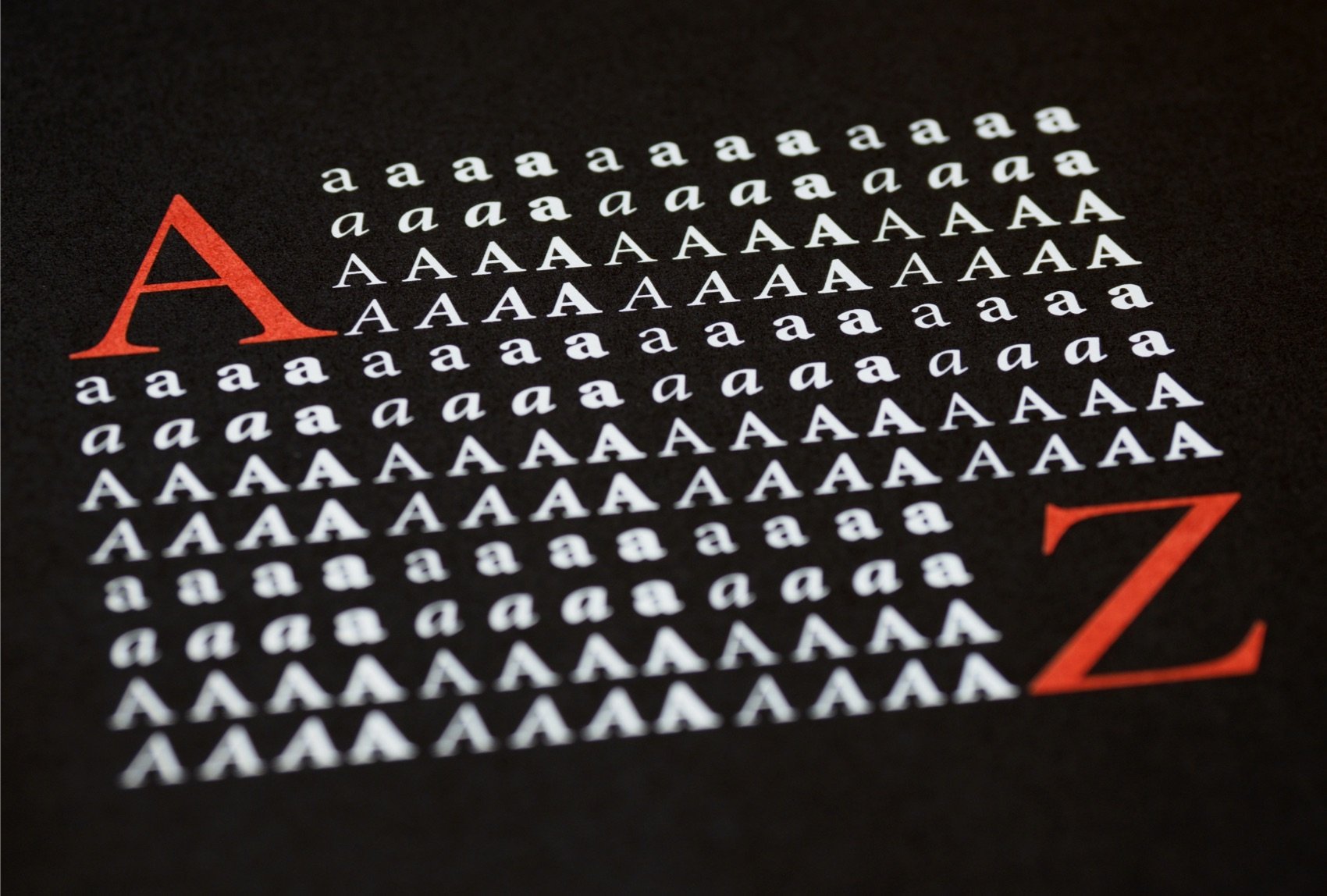
Typography holds immense importance in tech logo design. The right font choice can convey the style, tone, and uniqueness of your brand, leaving a lasting impression. When selecting fonts for your tech logo, consider factors such as legibility, readability, and the overall style and personality of your brand. Pay attention to font pairing and hierarchy to ensure a harmonious and impactful design.
Graphic Elements
In addition to color and typography, graphic elements play a crucial role in tech logo design. These elements, such as custom graphics, icons, and visual elements, contribute to conveying the personality and values of your brand. When incorporating graphic elements into your tech logo, consider how they synergize with your chosen color palette and typography, resulting in a cohesive and memorable design.
Create a Tech Logo in 5 Easy Steps
Create and edit logos with ease, no design skills required.
5 easy steps to create a logo
1. Select your industry and style preferences
2. Enter your company name
3. Review AI-generated proposals
4. Select and customize your chosen logo
5. Download your logo in high-quality files
Logo Maker and Logo Design
Other Logo Examples
Create your own logo now
Create and edit logos with ease, no design skills required.